Global
Header
The Header section encompasses essential elements for navigation and branding. It prominently displays the Logo for brand recognition. Below, the Mega Menu offers comprehensive navigation options, facilitating easy access to various sections. A Search Box enables quick product discovery, while strategically placed Links provide direct access to key pages, ensuring seamless user interaction.

Header components
The following component are used for the Header section
| Section | Component | Path | Description |
|---|---|---|---|
| Logo | Logo | components/ui/Logo/Logo.tsx | Showing logo on header & footer |
| Menu | Navigation | components/shared/Navigation/Navigation.tsx | Showing desktop mega menu |
| Search Box | SearchBar | components/shared/Search/SearchBar.tsx | Showing search panel on header |
| Links | MainNav | components/Header/MainNav.tsx | Contain all the header components with links |
Logo
Logo design is the icon that symbolically represents the company. It is the identifying emblem that people will recognise first and foremost that stands proud as a statement of the website, and online presence of the company.
Logo component
The following component are used for the header Logo
| Section | Component | Path | Description |
|---|---|---|---|
| Logo | Logo | components/ui/Logo/Logo.tsx | Showing logo on header & footer |
Mega Menu
A Mega Menu provides an extensive content panel, activated by user interaction with a menu item. It can include Sub-Menu items and widgets, enhancing navigation efficiency. Each sub-menu is categorized under a Sub Menu title, streamlining content organization for users.

Mega Menu components
The following component are used for the header Mega Menu
| Section | Component | Path | Description |
|---|---|---|---|
| Desktop Menu | Navigation | components/shared/Navigation/Navigation.tsx | Showing desktop mega menu with submenu code inside same component |
| Mobile Menu | MenuBar | components/shared/MenuBar/MenuBar.tsx | Showing mobile mega menu |
| Mobile Sub Menu | NavMobile | components/shared/Navigation/NavMobile.tsx | Showing mobile sub-menus |
Search Box
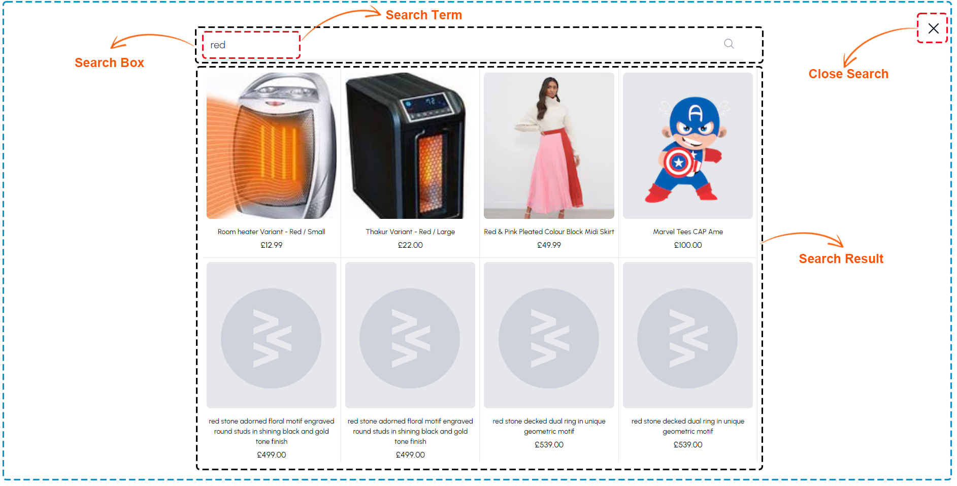
A Search Box (or search field) is a design pattern which allows the users to enter Search Terms in a system. As a result, the system returns content related to their input. The Search Box typically appears somewhere along the top of a Search Result, website, application or database, to ensure it is visible within the overall design. Close Search This action allows users to exit the search interface and return to the main content area of the website or application.

Search components
The following component are used for the header search panel and Search results
| Section | Component | Path | Description |
|---|---|---|---|
| Search Box | SearchBar | components/shared/Search/SearchBar.tsx | Showing search panel on header |
| Search Wrapper | SearchWrapper | components/shared/Search/index.tsx | Showing search modal with search result |
Links
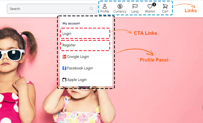
Link is an item like a word or button that points to another location. When you click on a Link, the link will take you to the target of the Link, which may be a Profile Panel, CTA links. Websites use hyperlinks as a way to navigate online content.

Header links components
The following component are used for the Header link icons
| Section | Component | Path | Description |
|---|---|---|---|
| Language | LangDropdown | components/LangDropdown.tsx | Showing language and currency switch options |
| Profile | AvatarDropdown | components/Header/AvatarDropdown.tsx | Showing my account dropdown links |
| Wishlist | Wishlist | components/shared/Wishlist/WishlistSidebarView.tsx | Showing user wishlist sidebar |
| Cart | CartDropdown | components/Header/CartDropdown.tsx | Showing icon link for mini bag |
Footer
Footer is the section of content at the very bottom of a web page. It typically contains a copyright notice, link to a privacy policy, sitemap, logo, contact information, social media icons, and an email sign-up form. In short, a footer contains information that improves a website's overall usability.

Footer components
The following component are used for the Footer
| Section | Component | Path | Description |
|---|---|---|---|
| Footer | Footer | components/Footer.tsx | Showing home page hero banner carousal |
| Logo | Logo | components/ui/Logo/Logo.tsx | Showing logo on header & footer |
| Socials List | SocialsList1 | components/shared/SocialsList1.tsx | Showing all social links in footer |
| Footer Menu | FooterMenu | components/shared/Footer.tsx | Showing all Footer menu |
| Newsletter | Newsletter | components/SectionPromo3.tsx | Showing newsletter form for subscription |