Product Detail Page (PDP)
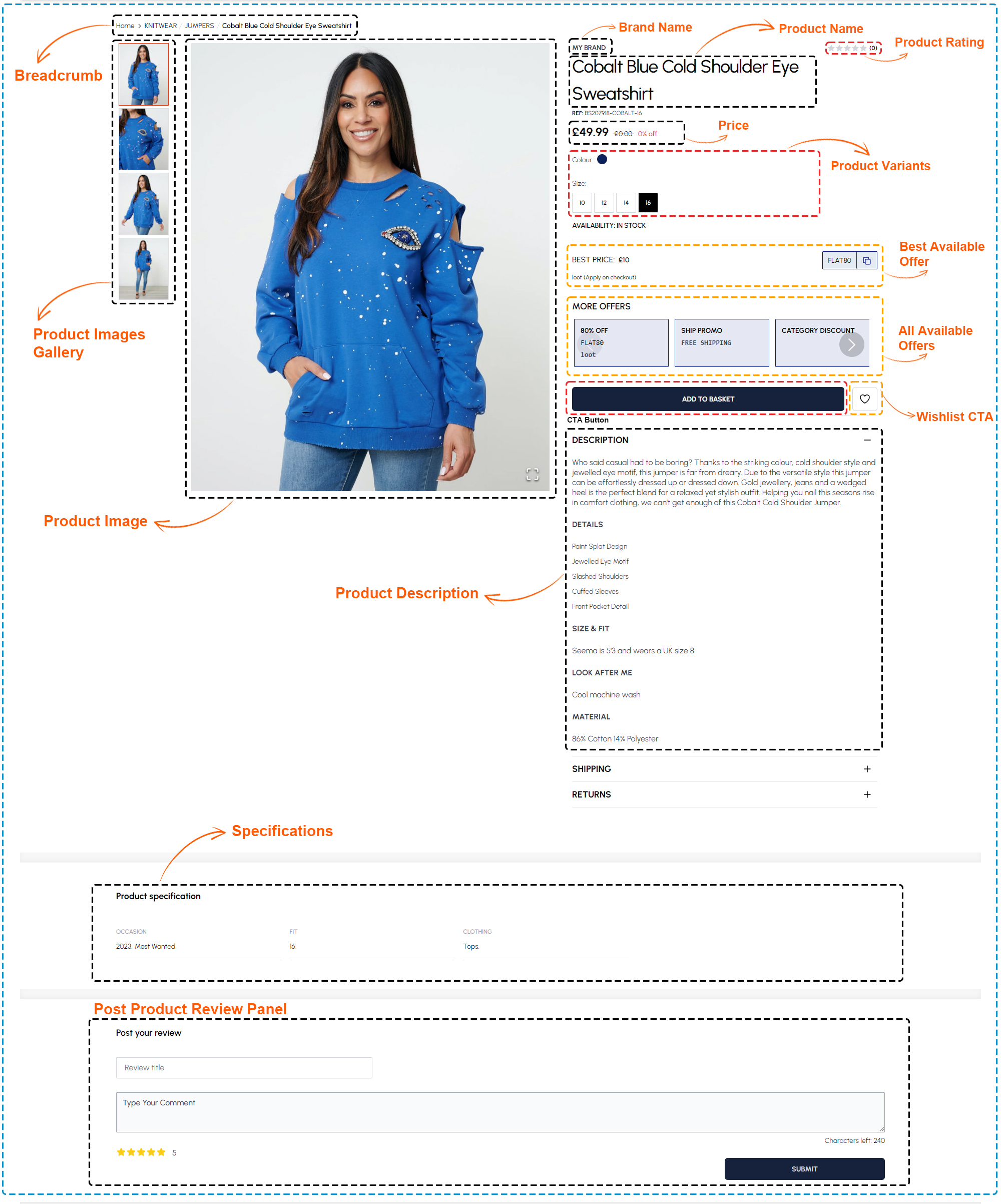
The Product Detail Page (PDP) incorporates essential components to facilitate a seamless shopping experience. Breadcrumbs enable easy navigation, guiding users back to previous pages and providing contextual information. The Product Images Gallery offers multiple views of the Product Image, aiding in assessing design, fit, and color options. A detailed Product Description provides vital information such as features, material composition (100% cotton), and care instructions, aiding customers in making informed decisions. Specifications, though currently empty, are reserved for technical details like size charts or fabric weight, ensuring comprehensive product information. The Post Product Review Panel allows customers to share their experiences, contributing to social proof and bolstering trust in the product. Together, these components enhance the PDP's effectiveness in assisting users and driving conversions
Product Detail components (PDP)
The following component are used for the Product details
| Section | Component | Path | Description |
|---|---|---|---|
| Breadcrumb | BreadCrumbs | components/ui/BreadCrumbs.tsx | Breadcrumb to navigate product native brand or category |
| Price | Prices | components/Prices.tsx | Showing product price, sell price and discounts |
| Variants | AttributesHandler | components/Product/AttributesHandler.tsx | All color, size, length and other product variants |
| Tags | ProductTag | components/Product/ProductTag.tsx | Product tag to show label for best seller, new, offers |
| Applicable offer | AvailableOffers | components/Product/AvailableOffers.tsx | Display best applicable offer for product |
| All Available offers | AvailableOffers | components/Product/AvailableOffers.tsx | Display all available offers/promotions |
| Delivery Info | DeliveryInfo | components/Product/DeliveryInfo.tsx | Showing product delivery information |
| Engraving | Engraving | components/Product/Engraving.tsx | Showing product customization option for applicable products |
| Quantity Break | QuantityBreak | components/Product/QuantiyBreak.tsx | Show quantity based offer price for product |
| Specifications | ProductSpecifications | components/Product/Specifications.tsx | Showing product specifications |
| Compare | PDPCompare | components/Product/PDPCompare.tsx | Display related products compare attributes for best purchase |
| Review | ReviewItem | components/ReviewItem.tsx | All user reviews and rating for open product |
| Bundles | Bundles | components/Product/Bundles.tsx | Show but together product bundle using relevant product combination |
| Related Product | RelatedProductWithGroup | RelatedProducts/RelatedProductWithGroup.tsx | Show related products as per open product |
| Engage Product | EngageProductCard | components/SectionEngagePanels/ProductCard.tsx | Fetch products from Engage according to user interest and recommendations |
Product images with zoom and gallery
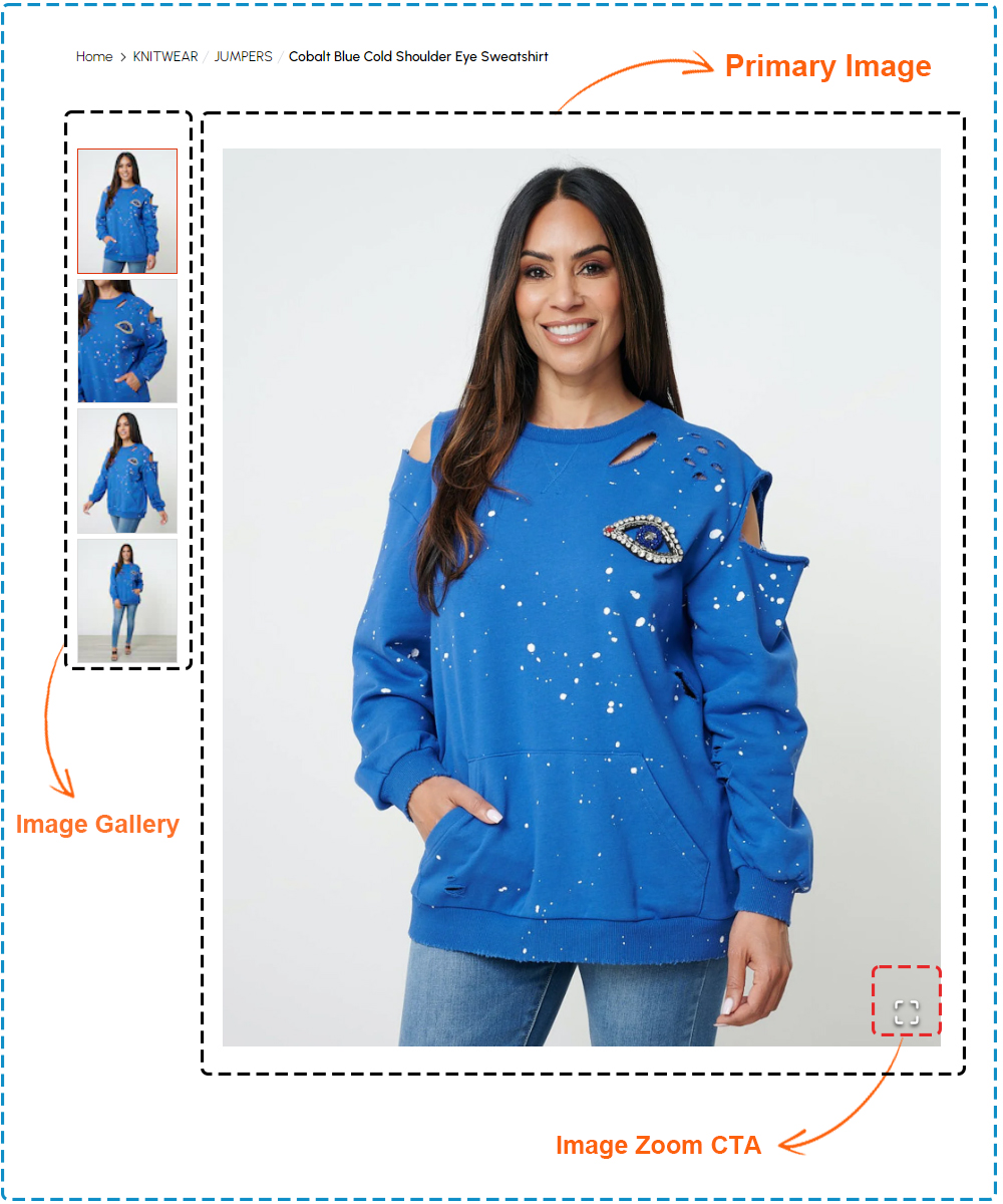
The Product Image Gallery section of the Product Detail Page (PDP) offers a comprehensive visual experience for customers. Featuring a list of product images in a Image Gallery, it allows users to explore various angles and details of the product. The Primary Image provides a prominent view of the product, instantly capturing attention and providing a starting point for further examination. The Image Zoom Call-to-Action (CTA) enhances the user experience, enabling customers to zoom in for a closer look at intricate designs or fabric texture. Together, these elements ensure that users can make well-informed decisions by thoroughly assessing the product's appearance and features
Product title, description, and specifications
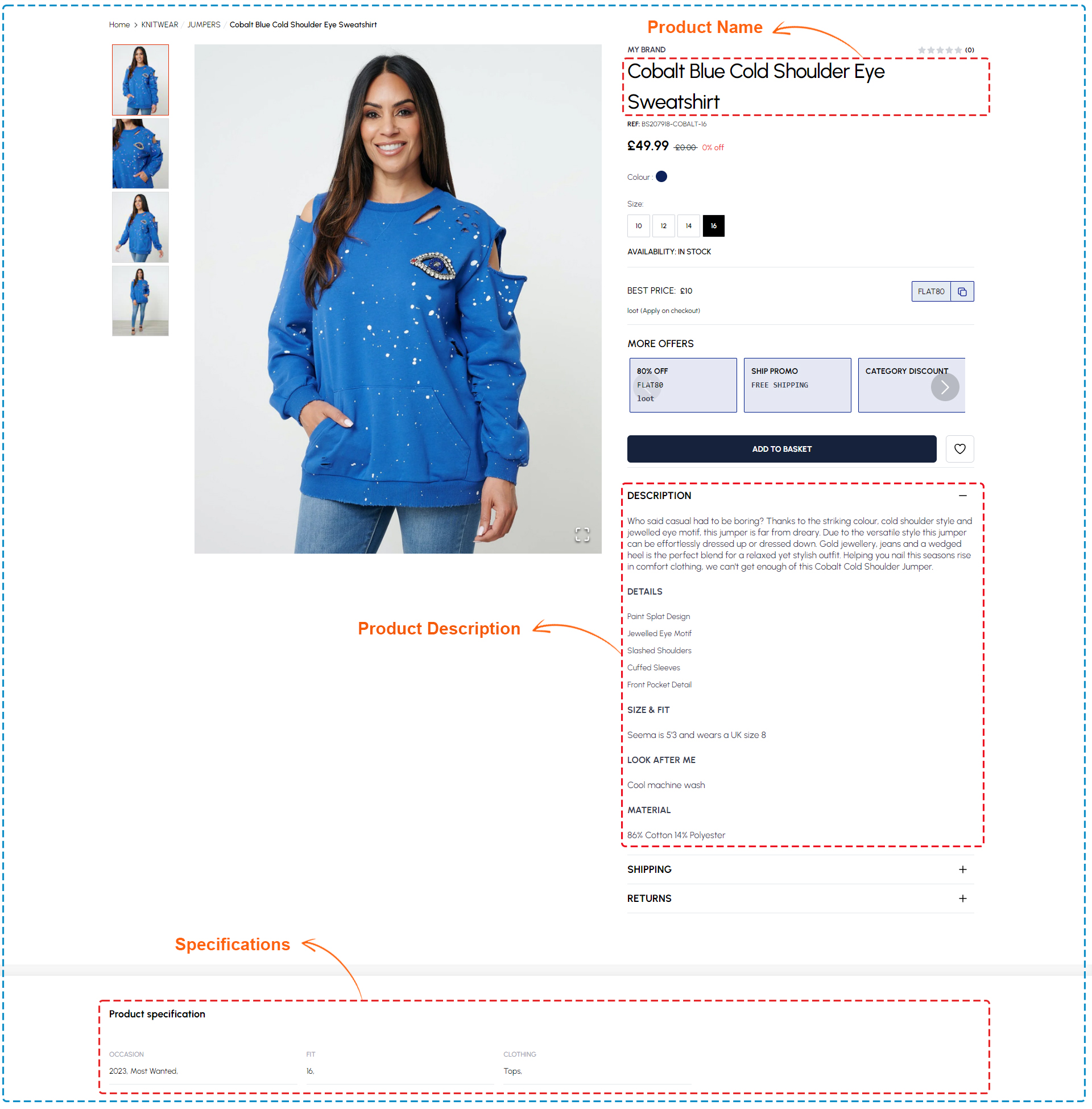
The Product Detail section on the PDP offers key information about the product. It includes the Product Title for identification, a Description detailing its features, and Specifications like fabric composition and care instructions. These concise components help customers understand the sweatshirt's attributes quickly, facilitating informed purchasing decisions.
Product title, description, and specifications components
The following component are used for the product Description and Specifications
| Section | Component | Path | Description |
|---|---|---|---|
| Product Description | DeliveryInfo | components/Product/DeliveryInfo.tsx | Find short and clear descriptions of products to help you choose quickly |
| Specifications | ProductSpecifications | components/Product/Specifications.tsx | Concise summary of product features, dimensions, and capabilities for quick understanding |
Pricing and discount information
The Pricing and Discount Information section on the Product Detail Page (PDP) is crucial for informing potential buyers about the product. It prominently displays the Product Price for transparency and clarity. Additionally, it lists all Available Offers, such as discounts or promotions, offering cost-saving opportunities. The section highlights the Best Available Offers, emphasizing the most advantageous discounts or discounted price. It may also include a space for users to input Promo Codes for extra savings, enhancing the shopping experience. Overall, this section aims to empower customers with pricing and discount options, facilitating cost-effective purchasing decisions.
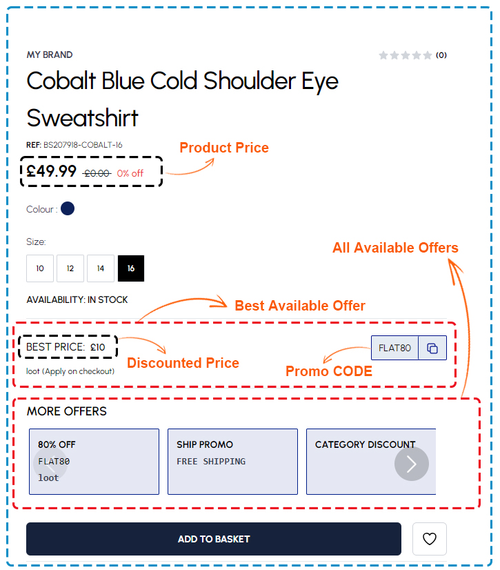
Product Pricing components
The following component are used for the Best available offer and More offers
| Section | Component | Path | Description |
|---|---|---|---|
| Price | Prices | components/Prices.tsx | Showing product price, sell price and discounts |
| Best Available offer | AvailableOffers | components/Product/AvailableOffers.tsx | Unlock unbeatable deals with our curated selection of the best offers available. |
| All Available offers | AvailableOffers | components/Product/AvailableOffers.tsx | Explore great deals and special offers made just for you. |
Add to cart button
The Add to Cart button on the PDP is a vital call-to-action for adding the product to the cart. Positioned prominently below pricing information, it prompts swift action from users. Featuring a bold design, it ensures visibility and encourages interaction. Clicking swiftly adds the item to the cart, streamlining the purchasing process and enhancing user experience.
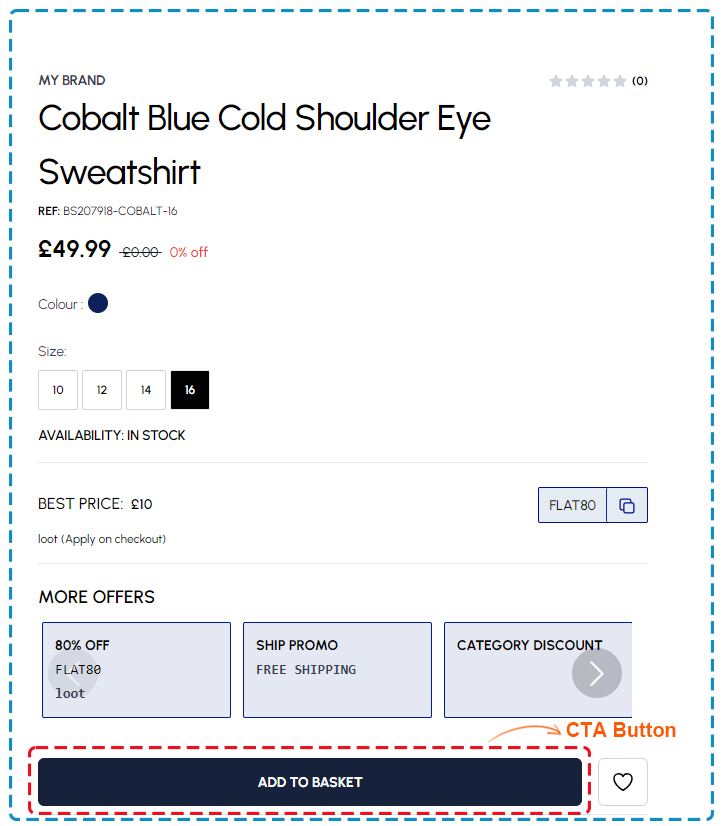
Product Add to cart button components
The following component are used for the CTA button
| Section | Component | Path | Description |
|---|---|---|---|
| CTA Button | Button | components/ui/IndigoButton.tsx | Showing CTA Button |
Product variants (e.g., sizes, colors)
The Product Variants panel on the Product Detail Page (PDP) provides users with options to customize their purchase of the product. It typically includes color variants, allowing selection from various hues, and size variants to accommodate different body types. This panel streamlines the shopping experience by presenting all available options in one convenient location, simplifying decision-making for customers. Ultimately, the Product Variants section enhances user experience by offering flexibility and choice, contributing to a more tailored shopping journey.
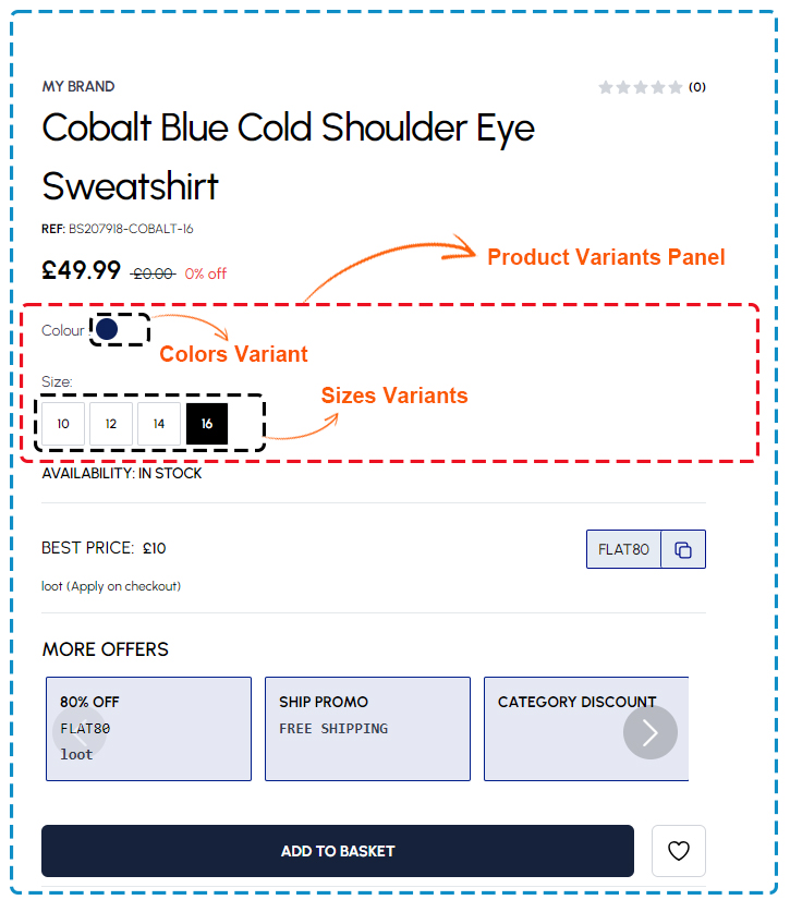
Product variants components
The following component are used for the Product variants
| Section | Component | Path | Description |
|---|---|---|---|
| Product Variants | AttributesHandler | components/Product/AttributesHandler.tsx | product variants offer different choices in color, size, style, and material to suit what people like and need. |
| Size | SizeInline | components/Product/SizeInline.tsx | Size variants allow customers to select the perfect fit |
| Color | InlineList | components/Product/InlineList.tsx | Color variants offer a range of hues to match personal style and preferences |
Customer reviews and ratings
The Customer Reviews and Ratings section on the Product Detail Page (PDP) shows feedback from previous buyers of the cobalt blue cold shoulder eye sweatshirt, including the Average Rating for a quick overview of satisfaction. Individual Customer Reviews offer insights into user experiences, aiding potential buyers. A Call-to-Action (CTA) button prompts users to contribute their own reviews, fostering engagement. This section provides a transparent platform for opinions, helping buyers make informed decisions.
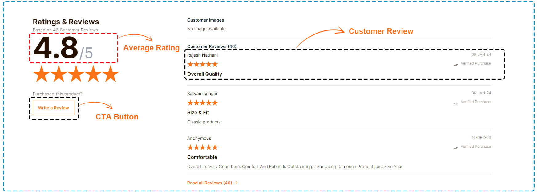
Customer reviews and ratings components
The following component are used for the Product review
| Section | Component | Path | Description |
|---|---|---|---|
| Review | ReviewItem | components/ReviewItem.tsx | All user reviews and rating for open product |
Related products or recommendations
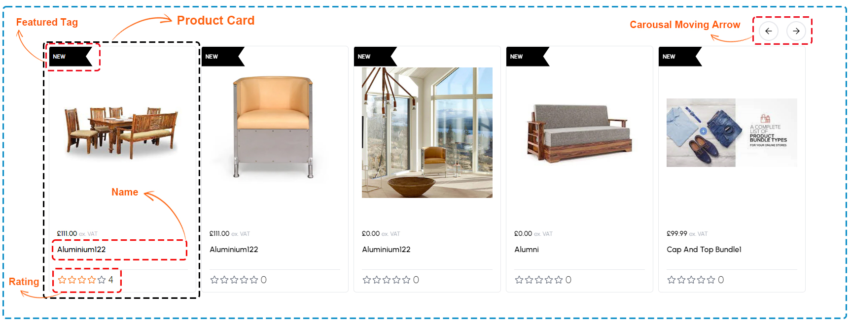
The Related Products or Recommendations section on the Product Detail Page (PDP) displays a carousel with Product Cards, each featuring essential information. These cards may include a Featured tag indicating status (e.g., On Sale, Out of Stock), the product name, and its rating. A Moving arrow facilitates easy navigation through the carousel, allowing users to explore additional options effortlessly. This section enhances the shopping experience by presenting relevant products and key details at a glance, aiding users in their purchasing journey.
Related products components
The following component are used for the Related products
| Section | Component | Path | Description |
|---|---|---|---|
| Related Product | RelatedProductWithGroup | RelatedProducts/RelatedProductWithGroup.tsx | Showing Related |
| Product Card | ProductCard | components/ProductCard.tsx | Showing product basic information. |
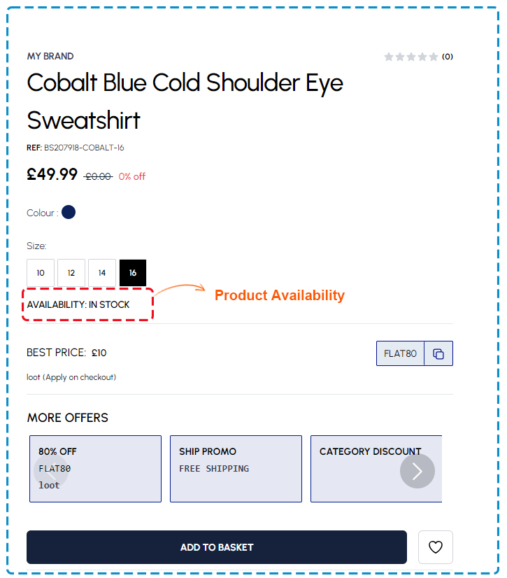
Product availability and shipping details
The Product Availability and Shipping Details section provides essential information regarding the product's availability and shipping. Users can quickly ascertain whether the product is in stock through a Product availability section and view relevant shipping information, such as delivery times and options. This section ensures transparency and clarity, helping customers make informed decisions about their purchase.
