Home Page
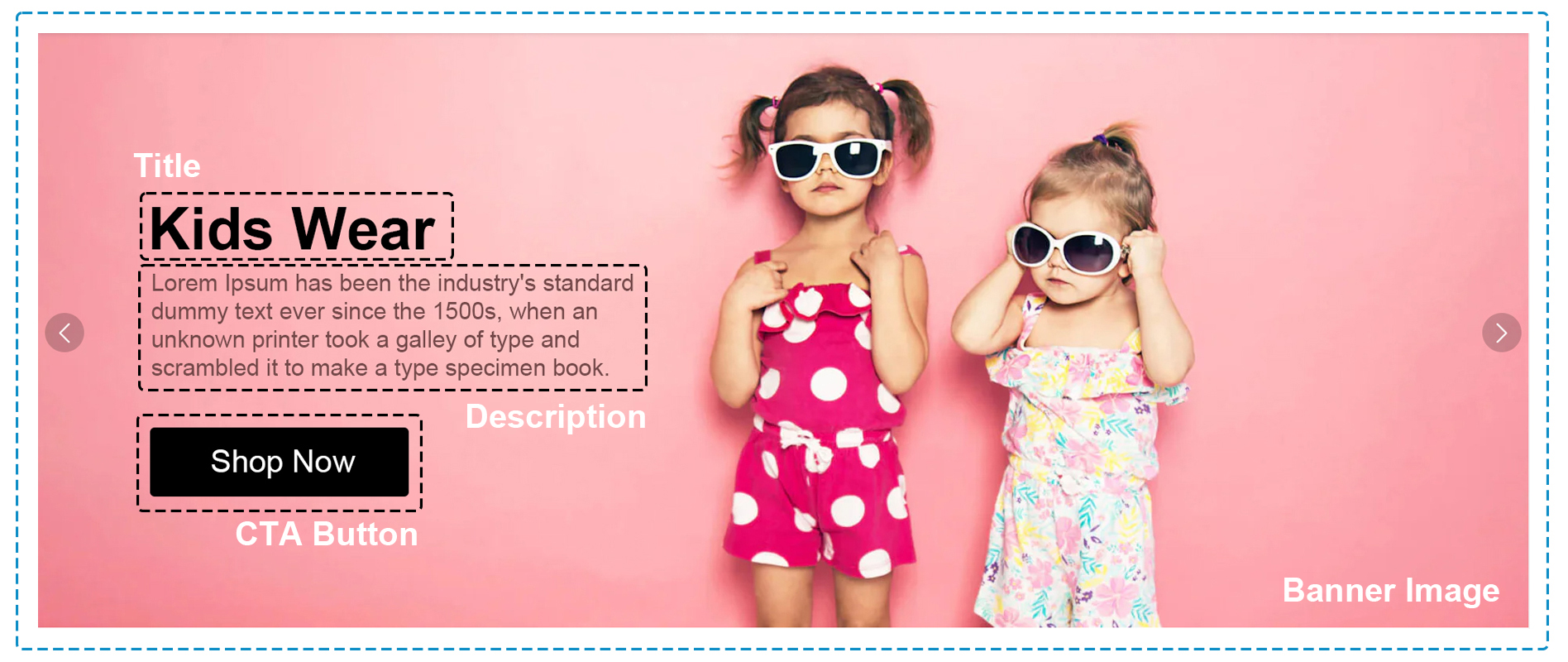
Carousel with Promotional banners
The Home Page features a carousel showcasing promotional banners with Titles, Descriptions, and prominent Call-to-action Buttons. Each banner entices user engagement, guiding visitors to explore further. Vibrant Banner Images complement the text, enhancing visual appeal and navigation.

Carousal components
The following component are used for the Hero banner
| Section | Component | Path | Description |
|---|---|---|---|
| Hero Banner Carousal | SectionHero2 | components/SectionHero/SectionHero2.tsx | Showing home page hero banner carousal |
Featured products or categories
Featured products or categories section highlights a Main Title and prominent Featured Categories. Each category is presented with its Name and accompanied by a compelling Call-to-action Button.

Featured category components
The following component are used for the Home page Category collection
| Section | Component | Path | Description |
|---|---|---|---|
| Category Slider | DiscoverMoreSlider | components/DiscoverMoreSlider.tsx | Showing home page slider |
| Category Card | CardCategory3 | components/CardCategories/CardCategory3.tsx | Showing category with all information |
| Heading | Heading | components/Heading/Heading.tsx | Showing category collection heading |
Bestsellers or trending items
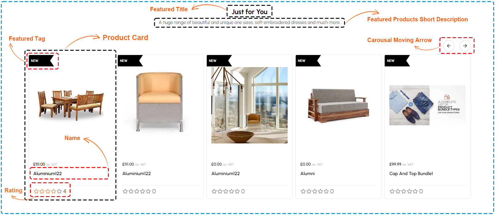
In the "Bestsellers or Trending Items" section, users encounter a Feature title setting the tone for the highlighted products. A Dynamic carousel with moving arrows enables effortless navigation through the selection. Each Product Card showcases its Name, a brief description, and a prominent Rating. Additionally, a distinct feature tag provides quick identification of trending items, enhancing the browsing experience.

Product Collection components
The following component are used for the Home page Product collection
| Section | Component | Path | Description |
|---|---|---|---|
| Product Slider | SectionSliderProductCard | components/SectionSliderProductCard.tsx | Showing home page product slider |
| Product Card | ProductCard | components/ProductCard.tsx | Showing product with all information |
| Heading | Heading | components/Heading/Heading.tsx | Showing product collection heading |
Testimonials or reviews
The "Testimonials or Reviews" section presents an Average Rating, providing an overview of customer satisfaction. Individual Ratings and reviews accompany descriptive feedback, offering insights into customer experiences. Each Review Description provides valuable feedback, aiding potential customers in making informed decisions.

Testimonials or reviews component
The following component are used for the Testimonials or reviews
| Section | Component | Path | Description |
|---|---|---|---|
| Reviews | Footer | components/Footer.tsx | Showing reviews and average rating in footer |