Product Listing Page (PLP)
A Product Listing Page (PLP) is a title indicating the category or search query, along with the total result count. Users can switch to any product view grids. PLPs have a comparison feature, allowing users to evaluate multiple products simultaneously. Sorting options enable users to organize products by relevance, price, or other criteria. Filters help narrow down results based on attributes. Pagination facilitates navigation through multiple pages.
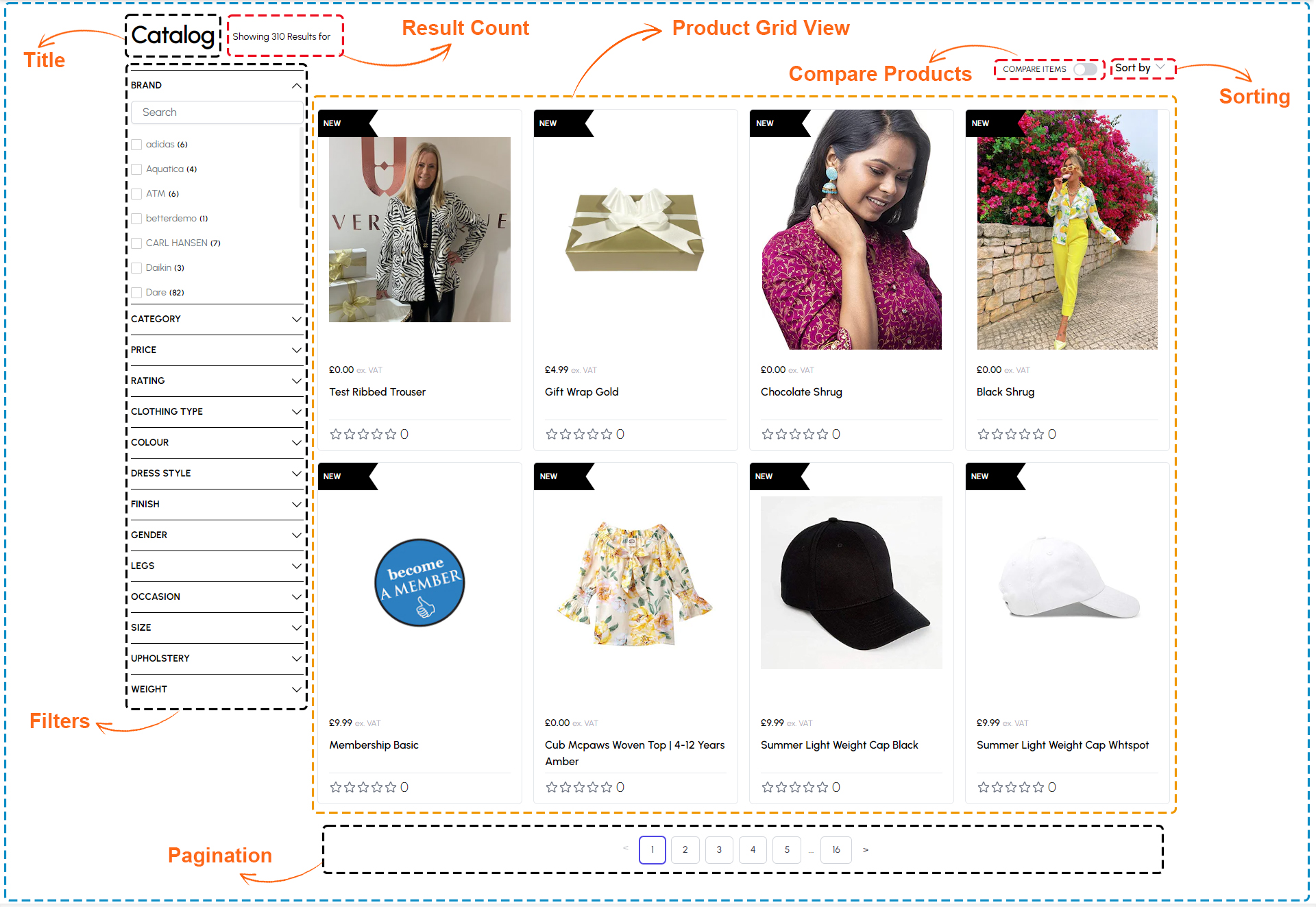
Components Product Listing Page (PLP)
The following component are used for the Product list page
| Section | Component | Path | Description |
|---|---|---|---|
| OOS Switch | OutOfStockFilter | components/Product/Filters/OutOfStockFilter.tsx | Show/Hide OOS Products |
| Filters | ProductFilterRight | components/Product/Filters/filtersRight.tsx | Show all available filters |
| Mobile Filter | ProductMobileFilters | components/Product/Filters.tsx | Show Filters on Mobile with different View |
| Top Panel | ProductFiltersTopBar | components/Product/Filters/FilterTopBar.tsx | Show result count, headings and etc. |
| Product Grid | ProductGrid | components/Product/Grid.tsx | Show product list view |
| Compare | CompareSelectionBar | components/Product/ProductCompare/compareSelectionBar.tsx | Compare product switch |
| Engage Product | EngageProductCard | components/SectionEngagePanels/ProductCard.tsx | Showing recommendation using engage module |
Filter and sorting options
Filtering option, users can refine search results based on criteria such as price range, brand, size, and color, with a dynamic search input and counts showing the number of products matching each criterion. Additionally, sorting options allow users to organize products by relevance, price, popularity, newest arrivals, or alphabetically, empowering users to customize their product discovery journey according to their preferences.
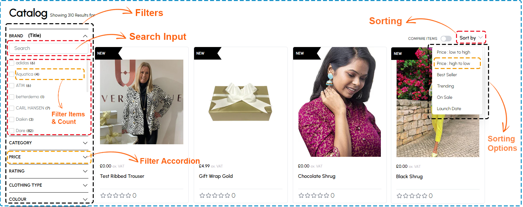
Filters and sorting components
The following component are used for the Filters and Sorting
| Section | Component | Path | Description |
|---|---|---|---|
| Filters | ProductFilterRight | components/Product/Filters/filtersRight.tsx | Show all available filters |
| Filter List | FilterList | components/Product/Filters/FilterList.tsx | Show different Filter list |
| Sort By | ProductSort | components/Product/ProductSort.tsx | Show product sorting dropdown options |
Grid or list view of products
The collection of product cards features images, names, and prices, alongside status tags like "New" or "Trending." Each card displays stock availability and product ratings for swift evaluation.
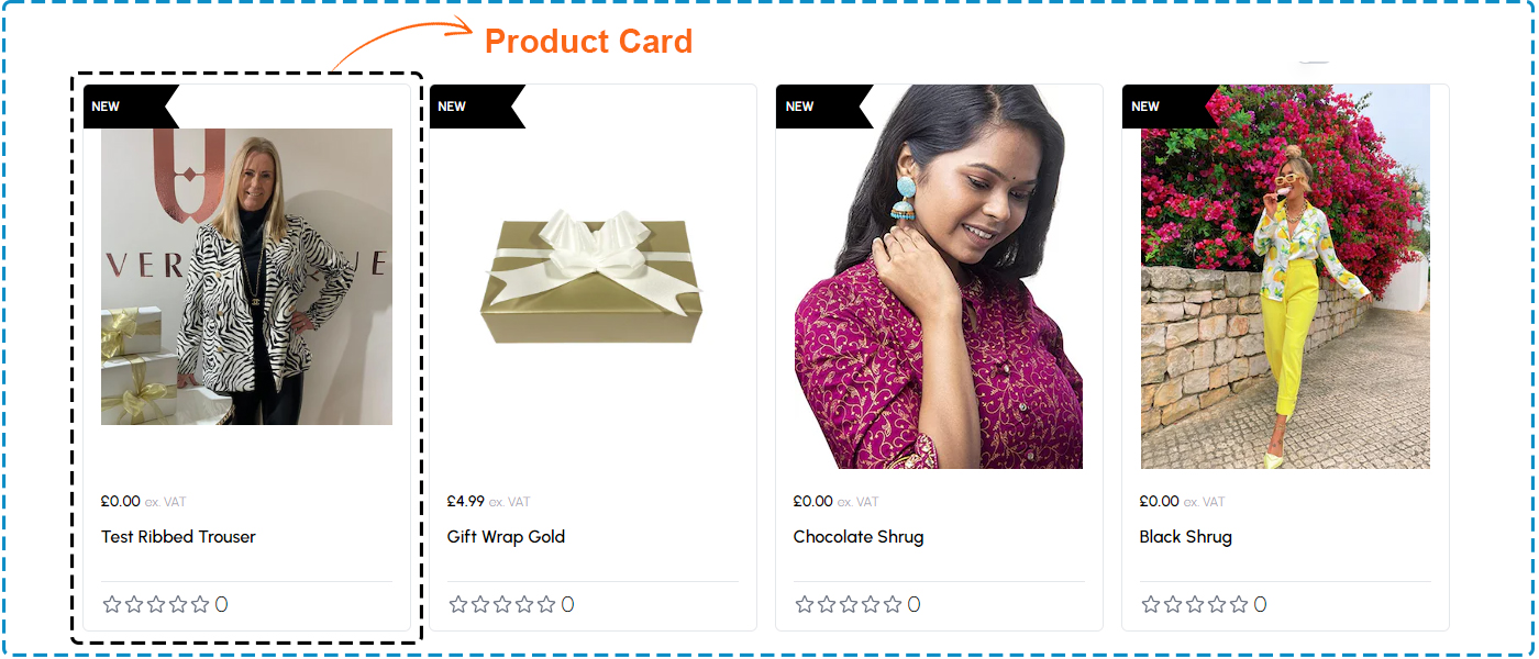
Grid or list view components
The following component are used for the product Grid or List view
| Section | Component | Path | Description |
|---|---|---|---|
| Product List | ProductGrid | components/Product/Grid.tsx | Show all products |
| Product Card | ProductCard | components/ProductCard.tsx | Show product card with all information |
| Infinite Scroll | InfiniteScroll | components/ui/InfiniteScroll.tsx | Showing product infinity scroll with load product on page scroll |
| Pagination | Pagination | components/Product/Pagination.tsx | Product List pagination |
Product images, names, and prices
Product card features a product tag indicating its status, whether it's "New," "Trending," or "On Sale." Furthermore, users can readily ascertain the current stock availability, ensuring timely decision-making. The product name is prominently displayed, accompanied by a product rating, allowing users to gauge product popularity and quality at a glance. This comprehensive display, coupled with captivating imagery, empowers users with the necessary information to make informed purchasing decisions efficiently.
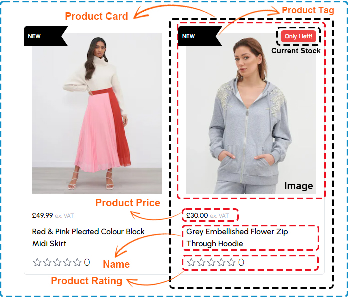
Product images, names, and prices components
The following component are used for the Product information
| Section | Component | Path | Description |
|---|---|---|---|
| Product Card | ProductCard | components/ProductCard.tsx | Show product card with all information |
| Prices | Prices | components/Prices.tsx | Showing product price |
| Product Tag | ProductTag | components/Product/ProductTag.tsx | Showing Product Tags like new, sale etc. |
| LikeButton | LikeButton | components/LikeButton.tsx | Add to wishlist button |
| Button | Button | components/ui/IndigoButton.tsx | Add to card CTA button |
| Button Secondary | ButtonSecondary | components/shared/Button/ButtonSecondary.tsx | Show product quick view button |
Quick view or wishlist buttons
The modal displays a product image, name, rating, and price, alongside product variants for selection. Users can interact with a call-to-action button to add the item to their cart and a wishlist button for future reference.
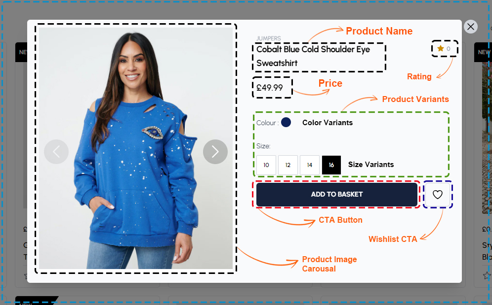
Quick view or Wishlist components
The following component are used for the Quick view or Wishlist
| Section | Component | Path | Description |
|---|---|---|---|
| Modal Quick View | ModalQuickView | components/ModalQuickView.tsx | Show product quick view modal with limited information |
| Product Card | ProductCard | components/ProductCard.tsx | Show product card with all information |
| Prices | Prices | components/Prices.tsx | Showing product price |
| AttributesHandler | AttributesHandler | components/Product/AttributesHandler.tsx | Showing product variants |
| Product Tag | ProductTag | components/Product/ProductTag.tsx | Showing Product Tags like new, sale etc. |
| Button Close | ButtonClose | components/shared/ButtonClose/ButtonClose.tsx | Button for close modal popover |
| Product Quick View | ProductQuickView | components/ProductQuickView.tsx | Showing Product Information |
| Engraving | Engraving | components/Product/Engraving.tsx | Enable Engraving option for product if availability |
| Button | Button | components/ui/IndigoButton.tsx | Add to card CTA button |
| Button Secondary | ButtonSecondary | components/shared/Button/ButtonSecondary.tsx | Show product quick view button |
Pagination or infinite scroll
Pagination allows users to navigate through multiple pages of products, while auto-loading on scroll dynamically fetches and displays additional products as the user scrolls down the page, providing a seamless browsing experience without the need for manual pagination clicks.
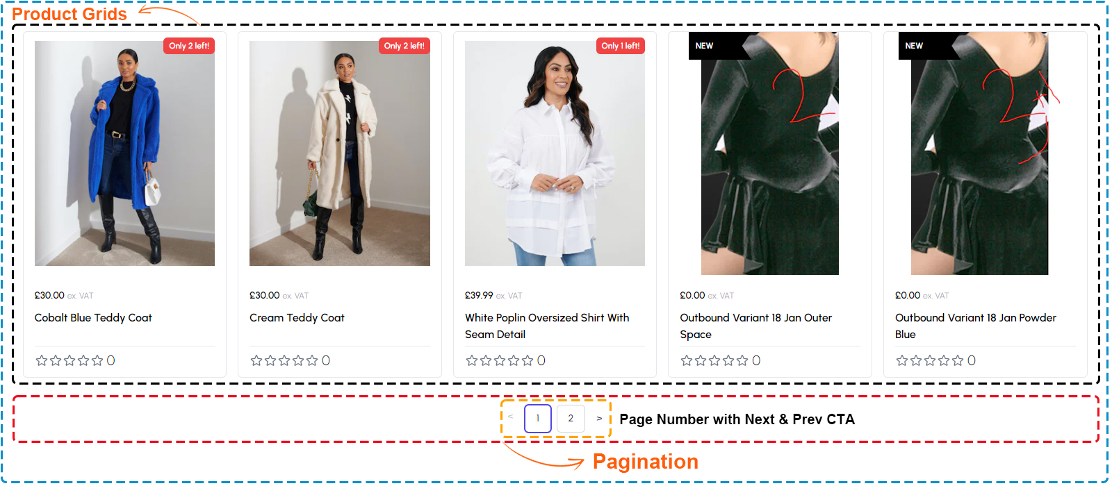
Pagination or infinite scroll components
The following component are used for the Pagination or Infinite scroll
| Section | Component | Path | Description |
|---|---|---|---|
| Infinite Scroll | InfiniteScroll | components/ui/InfiniteScroll.tsx | Showing product infinity scroll with load product on page scroll |
| Pagination | Pagination | components/Product/Pagination.tsx | Product List pagination which use react-paginate package |
Breadcrumbs for navigation
Breadcrumbs provide a hierarchical trail of links typically displayed at the top of a webpage, allowing users to easily navigate back to previous pages or categories within the website's structure.
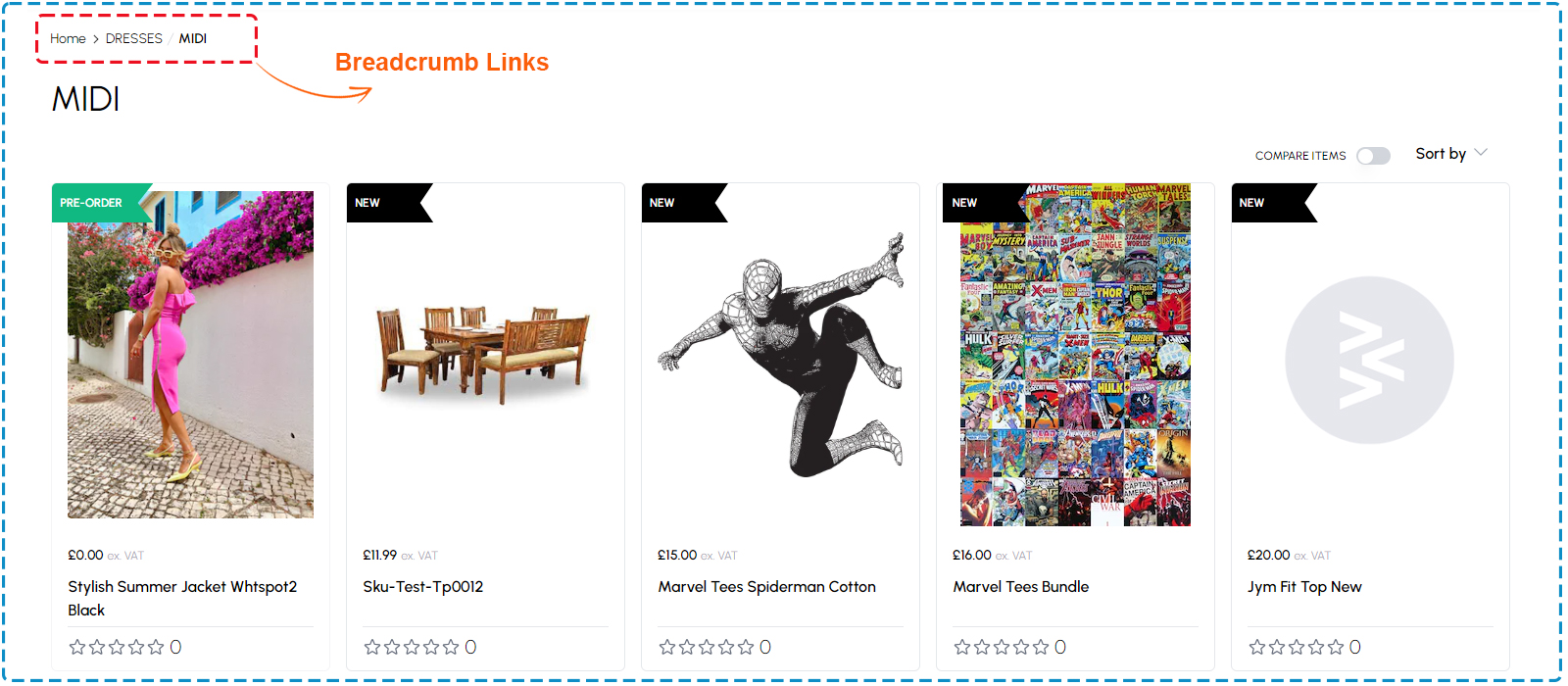
Breadcrumbs components
The following component are used for the Breadcrumbs
| Section | Component | Path | Description |
|---|---|---|---|
| Breadcrumb | BreadCrumbs | components/ui/BreadCrumbs.tsx | Showing page breadcrumb navigation |